Great email designs are a crucial element in email marketing
Even the best copy isn’t enough to create a winning campaign
Well-crafted email designs have the power to boost conversion, retention rates, and other Key Performance Indicators (KPIs)
The Big Picture:
When it comes to email marketing, optimize for mobile and use attention grabbing images. Even the best copywriters in the world cannot grab your attention the same way a stunning image and good design can — “a picture is worth a thousand words.” That’s why a great email design is important when you’re running your email campaigns.
Learn more about how to master marketing email design every time with these five tips.
Tip #1 – Optimize for mobile
Mobile commerce makes up the majority of online purchases globally, contributing to 59% of e-commerce sales in 2022 and expected to reach 62% in 2027, as RetailWire reported. With billions of mobile phone users worldwide, it’s crucial to design your emails for mobile users in the smartest way possible.
Approximately half of all emails are opened on mobile, so designing emails to render legibly across all devices, screens, and resolutions is critical. Knowing your customer (by having the right data) will assist you in this – for instance – which smartphone they use (Galaxy/iPhone), whether they use dark mode, what their screen sizes are, and more.
Moreover, if the email takes too long to load, it’s likely to be deleted in less than three seconds. And when deleted without being opened or clicked, it can negatively impact a sender’s reputation.
Great email design, especially in the context of mobile responsiveness, extends beyond merely adapting email layouts to different screen sizes, though. It involves the strategic presentation of content based on the specific device and environment in which the recipient engages with the content.
Responsive design goes beyond fitting the screen or aspect ratio; it prioritizes the relevance of displayed content. For instance, on mobile devices, the focus may shift to promoting app downloads exclusively. This approach ensures a seamless and tailored user experience, reinforcing the significance of thoughtful design in optimizing user engagement.
Stay in touch
Be the first to know all about the latest Marketing tips & tricks, Industry special insights and more
Tip #2 – Pick the right image
When an image is spot on, it will spark your customer’s feelings and emotions and inspire them to take action.
A professional email designer will never use just any image. Instead, they choose an image that will lead the customer to understand how they will benefit from the email’s promotion.
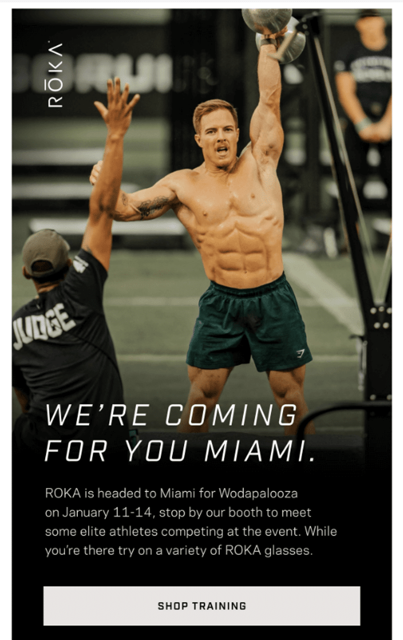
For example, Roka Glasses’ email below certainly grasps the reader’s attention and provides them with the experience they will likely receive when attending the Wodapalooza Fitness Festival.
Consider the diverse range of email recipients, including those who interact and make purchases on both desktop and mobile devices while dealing with disabilities, such as visual limitations. Others may rely on assistive devices and technology for email consumption, like reading their emails to them. Accessible designs allow all subscribers to engage with your messages while preserving the email’s usability – regardless of the recipient’s circumstances or needs.
An accessible email follows best practices with a logical flow of content, emphasizing highly descriptive content focused on features and benefits. It ensures that all images and key areas are hyperlinked, fonts are larger, and clickable areas have more white space for ease of use.
Moreover, accessible emails employ more text than images, with each image containing alt-text. This alt-text enables text-to-voice tools to read descriptions aloud, enhancing accessibility for all users.
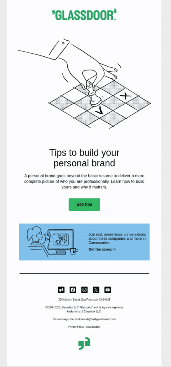
Glassdoor’s email below is the perfect example of a neat, simple design with an excellent white-space ratio.
Tip #4 – Guide the recipient to the Call to Action
Figure out how to guide their eye to the call to action (CTA). As the sender, you have control to “tell” the customer what you want them to do next, where you want them to click, and what you’d like them to do when they get there.
Leverage natural reading and eye movement patterns to focus the customer’s attention on the desired action you’d like them to take. Careful consideration of your layout based on the content you have can allow you to effectively guide your user’s eyes directly to the Call to Action (CTA.) So, use directional cues to draw attention to your email’s most important part or hero, making all other messages appear secondary.
When the content is targeted to a highly segmented audience, heat map data (the areas of an email that attract the most attention from users) shows us that the recipient is more likely to scroll for the CTA. But we also know that they click through on hero images because they’ve been trained to know that all images are linked.
Experienced email designers never “stuff in as much content as possible” into one email. Instead, they use a compelling CTA to get customers to click on a sales page (with all the relevant information required to purchase there.)
Now, for the final tip.
Tip #5 – Place your Call to Actions (CTAs) correctly
Though this goes hand in hand with the previous tip, many email marketers still need to grasp it.
The CTA buttons in your emails are what drive traffic to your site. That’s why you should include an additional CTA at the bottom of your email in case your audience scrolls down to read or learn more.
Stylistically speaking, it’s also the right way to end your email.
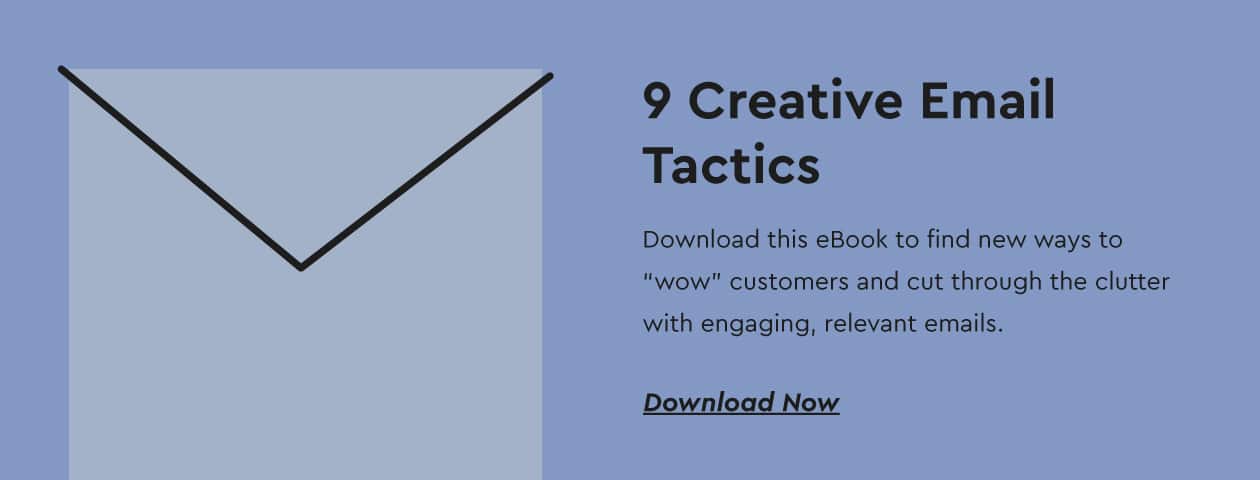
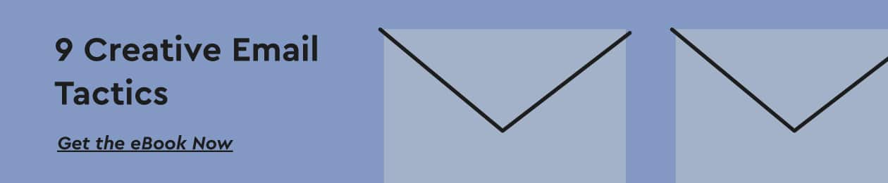
eBook: 9 Creative Email Tactics
Download this eBook to find new ways to “wow” customers and cut through the clutter with engaging, relevant emails.
Pro-tip: Slightly alter the copy on each button to maximize click rates.
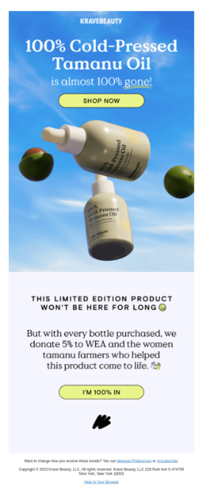
Take a look at KraveBeauty’s email below to see how they’ve properly placed CTAs at the top and bottom of the template. Two buttons accommodate readers at different points in their engagement and enhance the visibility and accessibility of their desired actions.
In Summary
The bottom line? Great email designs are crucial to the success of your email marketing campaigns.
The design and usability of your email not only influences its aesthetic appeal but can significantly impact your campaigns’ KPIs.
By putting your customer first, you’ll easily be able to design your emails smartly. Start by following these five tips that ensure optimal readability while maximizing user experience.
With OptiMail, you can take control of every aspect, from preparing to delivering and optimizing hyper-personalized email marketing campaigns.
Dana Carr is Optimove’s Director of Email Marketing. Dana has over 20 years managing the email marketing strategies of many recognizable global B2C and B2B brands. As the Director of Email Marketing, Dana is bridging the gap for Optimove’s customers in providing a data-driven marketing plan and timely implementation grounded in best practices, targeted content and visually engaging design.